It's time for a Challenging Challenge!
As you know, every so often I like to mix up the SRS Challenge with something that's a bit more in-depth. (And if this is overwhelming, just take the week off--I'll be back next week with an easier one.)
The Setup: If you read the news these days you'll see all kinds of claims about various kinds of data. In an earlier SRS post we talked about immigration rates, and found that the data is a bit complicated, but you can figure it out.
One of the things you'll see in the news are charts like this one:
 |
| .. by COUNTY (not MSA or CSA). |
This is the "Median household income in 2012 by county." This chart is from Wikimedia and shows the median income by county in the US. Of course, counties are sometimes just arbitrary boundaries. They may or may-not make sense. (For instance, Los Angeles County has around 10M souls living inside the county, while only 600K people live in Providence county, Rhode Island. That's a factor of 16X difference in size.)
There are many ways to draw regional boundaries that make some kind of sense. For instance, gerrymandering is the practice of drawing political boundaries to give a particular party more (or less) voting power.
There are commercial regional boundaries (such as the "Designated Market Areas," aka DMAs, define by the polling / survey company Nielsen). These regions correspond to media markets.
More often, though, people who are looking at data use either "Metropolitan Statistical Areas" (MSA). An MSA is “is a geographical region with a relatively high population density at its core and close economic ties throughout the area.”
For instance, the San Francisco-Oakland-Hayward Metropolitan Statistical Area (with a population of 4.5 million) and the larger San Jose-San Francisco-Oakland Combined Statistical Area (8.4 million) are both near where I live in Silicon Valley.
A slightly different version of the MSA is the "Combined Statistical Area" (CSA), whi is composed of "adjacent metropolitan (MSA) and micropolitan (μSA) regions in the United States and Puerto Rico that can demonstrate economic or social linkage." (This is primarily defined by commuting patterns.)
A map of the combined metropolitan and micropolitan statistical areas of the US looks like this:
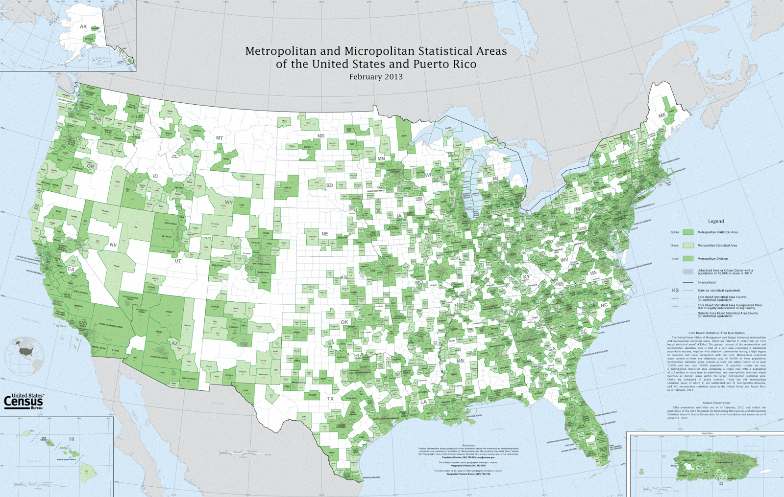 |
| Wikimedia |
I'm telling you all of this background because it leads to today's Challenge.
1. Can you make a map of the median household income for each of the MSAs in the United States? (Or equivalent statistical areas, if you're from another country.)
That is, you'll need to:
A. Find a source of recent data that's organized by MSAs. 2017 would be best, but you should look for the most recent data.
B. Find a visualization application that can ingest both the median income data and the shape of the MSA.
C. Figure out a way to create a visualization of the US MSAs that color-codes the income. It should look a bit like the above example, except with the income level determining the color of the MSA region.
This is a bit of a Challenge, but it doesn't require programming. (If you want to program, be my guest, but this doesn't really need it.)
And, if you really don't like MSAs as the boundaries of map regions... find a different one, and tell us why you like yours better.
Once you figure out how to do this, you'll have the means to do your own analysis, looking at data in your own way.
Search on!
P.S. This is the kind of thing that Data Scientists do all the time. With this Challenge, I'm hoping to instill some of the skills and values that Data Scientists bring to the job every day. Hope you have fun with it. I'm looking forward to your comments!
Good Morning/Day
ReplyDeleteVery interesting Challenge. I didn't know about these MSA. I am trying to at least find the data. Found the links were broken
Also looking for the way Mexico does this. I think we make the division with States. I tried to find the answer yesterday. Not luck yet
Searching for the Mexico’s case thought, after looking for other ways, to try simple translation
DeleteMetropolitan Statistical Areas = [área estadística metropolitana México]
Areas in Spanish
74 zonas metropolitanas. In 1960 12 zones. In 2015 we have 74
[ingreso promedio México por zona metropolitana]
Information in Spanish PDF (2012)
Then searched what DDI and RFD meant
La Red Nacional de Metadatos (RNM). Iniciativa de Documentación de Datos (DDI, por sus siglas en inglés).
RDF: Resource Description Framework
Hmm I guess this is cheating, but I would use my library's subscription to either PolicyMap or Social Explorer, both of which can map data by MSA. The current income data is 2012-2016 American Community Survey (5-year survey, the most accurate ACS data).
ReplyDelete