Our goal is to plot data by region..
.. an immensely handy thing to be able to do if you want to do basic analysis of geo-localized data. For instance, here's a map of all the counties in the US, with color mapping out the median income for each county:
 |
| Figure 1. Median household income by county (2012). P/C Wikimedia. |
Our Challenge for this week was to do something very similar--let me remind you of our Challenge:
1. Can you make a map of the median household income for each of the MSAs in the United States? (Or equivalent statistical areas, if you're from another country.)
As I pointed out, we can break down this problem into a few pieces:
1. Find a data set for the median household income that's organized by MSAs.
2. FInd a data set for the MSAs shapes.
3. Find a visualization application that can ingest both the median income data and the shape of the MSA and create a map similar to that above.
Here's what I did for each of the three steps.
1. Find the data set.
My query to find the MSA income data:
[ median income united states data 2017 intext:msa ]
This query led me fairly quickly to the FFIEC data tables (Federal Financial Instutions Examination Council).
Remember that the intext: operator requires that the term "MSA" be part of the document. That's exactly what I needed to do in order to find this.
 |
| Figure 2. The data for median family income by MSA. |
In particular, it wasn't hard to find that https://www.ffiec.gov/Medianincome.htm had an Excel spreadsheet with median incomes where each row has the income and the code for one of the MSA regions.
This gives us the following spreadsheet (I downloaded the EXCEL file in row 1 above):
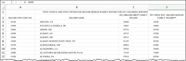 |
| Figure 3. The data table opened up to show the first 11 values of median income. Note the NSA/MD FIPS CODE NO. (That's the code for the particular MSA region.) |
I opened this XLS, then deleted row 1 (to get rid of the not-very-useful heading information) and then deleted column C (to get rid of the data from 2015 that I don't want to show).
Then, I opened that Excel file in Fusion Tables because I happen to know that Fusion Tables has a way to import both Excel data files (like the one above) AND shape-files (like those that define the MSAs).
That Fusion Table now looks like this with just the GEOID (that is, the MSA number), the MSA area name, and the FFEIC estimated median family income (which is what we wanted to plot):
 |
| Figure 4. The data from the XLS spreadsheet imported into a Fusion Table. |
Now I need to find the MSA boundaries. How can I do that? Easy. I did a search for KML files (which I know Fusion Tables can read) with this query:
[ census metropolitan cartographic
boundary KML files ]
On that page, I found the Core Based Statistical Areas (CBSAs in KML
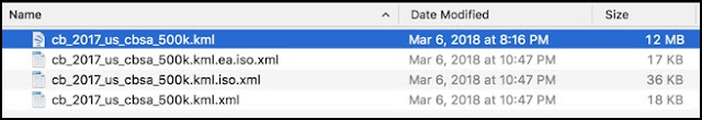
format): cb_2017_us_cbsa_500k.zip This is a ZIP file (compressed), so you have to download it and decompress it, which gives you a bunch of .KML and .XML files. Here, I'm just interested in the KML files. They're the MSA "shapefiles," each of which outlines each of the MSAs.
Now I want to somehow grab all of these MSA shapes and line them up with each MSA median household data. To do this, I'm going to import these shapes into a second Fusion Table, then merge the two tables together. I'll make sure that both tables have rows that can line up and can be merged together because they have the same name and same values.
Here's how I did it:
We've already got one Fusion Table with all of the median incomes and a GEOID code telling us what MSA area that data represents. Now, make a second Fusion Table to hold all of the KML regions, each of which has a code that's the same as the GEOID code.
 |
| Figure 5. The KML (shapefiles) for each of the MSAs in the US. |
You can import the KML into it by just opening the KML file. This should have a nice map with all 462 MSA regions on a map of the US.
Once you open the cb_2017_us_cbsa_500K.kml file in Fusion Tables, you should see this:
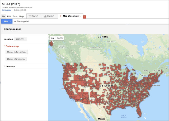 |
Figure 6: Fusion Table after I loaded the KML file with all of the MSA shapes.
This shows all of the MSA shapes in the KML file. Notice anything odd? |
If you click on the Rows1 tab, you'll see each row that defines one of those MSA shapes. (The actual KML is in the far right-hand column.)
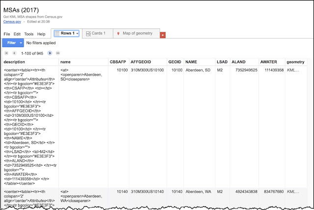 |
Figure 7. The MSA Fusion Table with the GEOID in the 4th column,
and the geometry of each MSA in the rightmost column |
Now, let's step back for a second.
We have 2 Fusion Tables. One with the median income and an MSA region (both with the name and the GEOID for that region). The other table has the KML shapes and a GEOID.
Now I want to MERGE the MSAs map shapes into the MSA income data where the rows have the same GEOID (that is, the same MSA region).
Notice that the
column labeled GEOID has a unique identifier for each MSA region. Notice that the Median income data table also has
a column labeled “MSA/MD FIPS CODE NO.” – that’s the same thing.
Now, START with the Income Fusion Table.
Then select File>Find a Table to merge into this one. The idea is that we'll pull in the MSA shapes (from the MSAs (2017) Fusion Table) and line up the matching rows with the same GEOIDs.
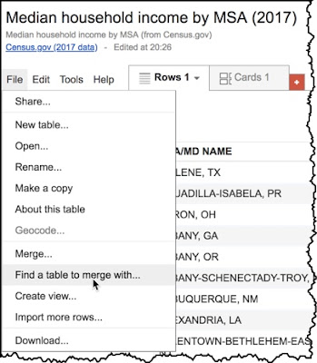 |
Figure 8. How to merge the household income Fusion Table with another table.
(That is, to "fuse" them together.) |
Select a table (with matching columns):
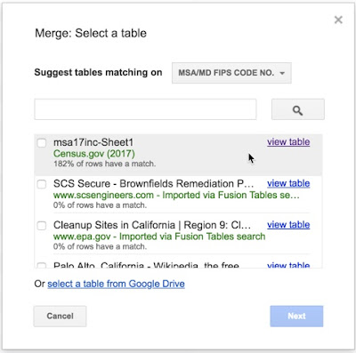 |
| Figure 9. Select the corresponding spreadsheet (in this case, the first one with the income data). |
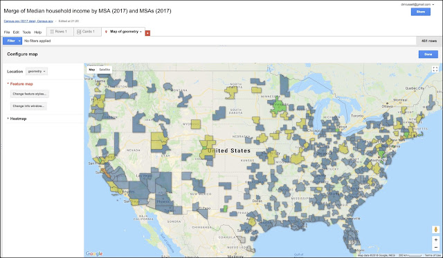
When you do this, it will align the rows with the same data in the GEOIDs field, and give you something like this.
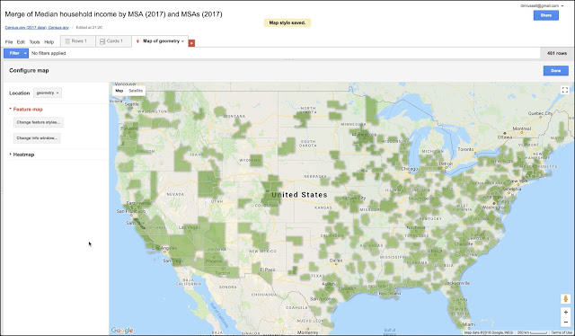 |
| Figure 10. The default MSA median income data shown as a color of green. (This is the default coloring pattern.) |
There are a couple of problems with this map.
(1) The colors are all kind of the same. The default color scheme is a gradient of greens, but that doesn't quite distinguish the different values very well. We can fix this by changing the colors assigned to each income range. To do this, you have to edit the colors assigned to each income range. To do this, you have to change the settings for the "map feature style"
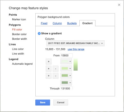 |
Figure 11. How to change the polygon fill pattern to show
different income ranges as differing colors. |
What you'll want to do is to change the range / color assignment. To do this, just click on the "Buckets" tab. That menu looks like this:
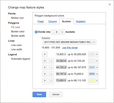 |
| Figure 11. Changing the buckets and the corresponding colors. |
This menu option lets you change the bucket sizes (and notice that you have to scroll to get to all of the buckets). For each bucket, you can pick your own colors. Here's another version of the median income map. You can easily change the colors to emphasize (or de-emphasize) whatever data features you'd like.
 |
| Figure 12. The new MSA map with a somewhat better color choice. |
However...
(2) The biggest surprise to me was how many MSAs seem to be missing, including some close to where I live. (See the map below...) In particular, how is it possible that the greater San Francisco area is missing?
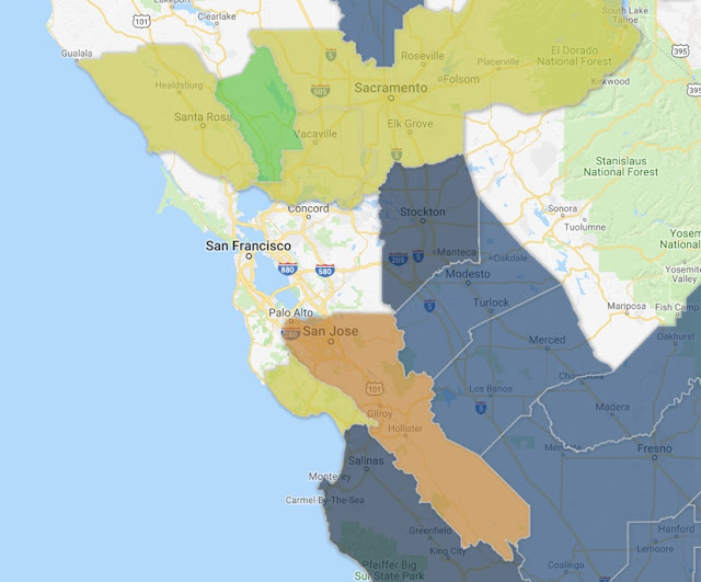 |
| Figure 13. A closeup of the map. Some MSA regions seem to be missing! |
What happened to San Francisco??
There's some kind of missing data. This was so striking, I had to check.
First, look up above at the map that shows all of the MSAs ("MSAs (2017)" with all of the red blobs). There are a LOT of open spaces in the map. Surprise! The MSAs do not cover the entire United States. I didn't realize this when we started this Challenge, but the MSAs are an incomplete cover of the US landscape. That's observation 1.
Second, it looks like some MSAs are just plain missing in the original spreadsheets. (See Figures 3 and 4. We can see that the MSA region is in the dataset for San Francisco, but when we look in the median income database, we see it's in there.
I puzzled over this for a long time (like... 4 hours!) before I figured out what happened. The GEOID code for the San Francisco MSA was wrong in the map file. I noticed this because I finally pulled out the records for both the MSA spreadsheet and the one line of the MSAs Regions KML file. In the "median income" file, the GEOID was 41884, while in the "KML regions" file, the code was 42034!
Basically, a Fusion Table takes two (or more) data tables that have a column in common. In this case, I used the GEOID code to line up the data sets. As you saw, it worked pretty well.
But if a code is wrong (as it was in the MSA KML mapping file), then only half of the data transfers--in this case, the KML region doesn't get copied over. Damn. THAT took a while!
To fix it, I just opened the "incomes" spreadsheet, and fixed the GEOID number so it would line up with the KML regions file. And, voila! The closeup of the San Francisco region now looks like this (notice that I changed the colors once again... I was experimenting with different settings):
And yes, the Median Family Income for the Bay Area in 2017 was $113,100 / year.
Naturally, after I did all this, as I was cleaning up my tabs I found a really great example (with videos!) on how to do this. If you're interested in this kind of data understanding, check out Ken Blake's instructional web page and videos. (It's really done quite well.)
SearchResearch Lessons
Well, we didn't get a lot of comments this past week. I don't know if it's the summer slump, or if people just didn't find this kind of demographic analysis interesting! (Let me know in the comments. If nobody speaks up, I won't do many of these in the future.)
There were a couple of things to take away from this lesson:
1. You have to know what your tools can do. In this case, I had a headstart because I knew that Fusion Tables could do something close to this (especially the mapping part). Of course, one of the SRS skills is toolfinding. (When you find yourself trying to do something complicated, check for a tool that can help you out.)
2. Remember how to use intext: to require that a particular key search term is on the page. When you really need that term to be there, intext: can really, really help.
3. Not all data sets are error free! Yes, I know this data set came from the government... but they have typos too. And remember that as data sets grow larger, it gets increasingly difficult to spot typo-type errors. An excellent practice is to spot check a number of different locations (and to check with a filter, if you can). I ended up finding several more coding errors in that data set.
Postscript: Sorry that this week's SRS post was a little delayed. I was traveling to a wonderful event--the Salzburg Global Seminar--and was busy giving talks, and talking with a bunch of very smart and completely fascinating people. I'm actually flying on Wednesday, but will try to post the Challenge before we lift off. (But if I don't get it out, you'll know what happened.)


