Monday, June 24, 2024

SearchResearch hit 5 million reads!

When I started writing... 

P/C Dalle-3. I tried to show 5M people, but that's a bit too much... 


... SearchResearch back in 2010, I wasn't sure how many people would be interested in reading about the fine details of online research.  It was unclear how many folks would want to spend part of each week learning how to Search-by-Image, or use some obscure Google Maps function, or even how to use online dictionaries to find just the right word. 

But here we are, 14 years, 1,402 posts and 14,050 comments later.  More impressively, we just clicked over on our 5-millionth online read!  I know some number of those reads are bots, but if each reader spent (on average) 1 minute / read, that's a total of 28.5 years of people reading SRS for 8 hours / day.  

FWIW, I know this is a pretty serious undercount of human read-time--SRS is syndicated in a couple of different places that I know about, and I see copies of the posts all over the place that are unofficial reposts.  I don't have data for all of those.  

But for just the SearchResearch posts you see here on Blogger, the data looks like this: 


There are a few fun spikes in the data (such as that spike in Feb, 2024, when we had 91K readers in a single week when I wrote a piece about AI and search).  But in general, SRS has around 1,000 readers each day, averaging around 32K / month.  

And, for those of you who remember the PowersearchWithGoogle MOOC (our online class, still available at edX).. the last time I checked the numbers there, we had around 5M students take that course, so there's clearly a demand for this kind of knowledge.   
 
FWIW, the accumulated watch time of those videos was greater than 400 years of total watching!  It's frightening to consider that my talking head has been on someone's YouTube screen for more than 400 years of 24 hours Dan-talking-about-search each day.  


My thanks go to all of you for dropping by and checking out the latest in online research methods.  Who knew that we'd be quite so large a community!  

Many more thanks to our regular contributors.  You know who you are, and I'm grateful for all of you.  

As we say... 

Keep searching! 

(Or as we used to say, "Search on!")  

-- Dan 


Thursday, June 20, 2024

Answer: Timeline of megalithic monuments?

 Ancient monumental architecture... 

Chichén Itzá  P/C by Wikimedia


... is always a fun topic--I always wonder how could people build monuments / temples / religious sites like the pyramids of Egypt, the moai of Easter Island, or the fabulous buildings in Peru?  In particular, how could they do it without advanced power technologies?  In the case of many of these older sites, they were built without any wheeled devices!  

I'm not convinced by any of the stories about ancient astronauts or other mythical creates that helped put everything together--I'm just very impressed by the degree of social and political organization required to build these places.    

One of the questions I always have is how do the different places relate to each other in time?  That is, was Stonehenge built around the same time as the great Mexican monuments like Chichén Itzá, or was it a very different time?  

For these kinds of questions, creating a timeline is the best solution--so I'm re-asking the question--what's the best way now (2024) to make a timeline showing megalithic monuments dates?   

1.  What is the current best solution for creating a visual timeline of various historic events?  Can you create  timeline that shows each of these monuments over time?  The list: Chichén Itzá, Monte Albán, Stonehenge, Göbekli Tepe, the moai of Easter Island, the Mausoleum of the First Qin Emperor, and the Serpent Mound in Ohio.  

To begin, I just did the obvious searches on each of the sites Wikipedia pages and found this set of dates: (link to my Google sheet)


Note:  If you ask your favorite LLM to give you these dates, they will find somewhat different dates than these. (And in some cases, they will be wrong by a couple thousand years.  Pro tip:  When asking for verifiable data like this, don't trust the LLM to give you the correct data, but go source it from reputable places.)  


Regular Reader remmij did a great search to find timeline tools: 

     [tools for creating historic timelines] 

The term "historic" is important here as it will limit the results to timeline tools that are useful across a wide range of dates.  Note that everyday tools like Excel and Google Sheets use a 1900-based date system.  That makes it very painful to represent dates BC / BCE.  

The SERP shows a bunch of results, some of which are more useful than others.  Of the ones in the list that I was able to get to work, Northwestern University Knight Lab’s TimelineJS was nice, but not perfect. (Note: This was the first tool in the SRS post from 2015--it's still out there and working!)  It's a bit twiddly to get it to work and the documentation isn't the best, but I got it to work.  

TimelineJS overview of the megalith sites list. I never did figure out how to get each of the eras to appear on a different line, which leads to serious overlap.


However, clicking in on a site give you a preview of an image of the site, etc. 
(P/C K. Mitch Hodge, Unsplash)


In a comment, Ramón pointed us to Time.graphics.  It's a fairly basic system, but was very simple to use and created a beautiful timeline.  (Click on the image below to see it in full resolution.)  


Of all the timelines I tried, this was by far the simplest.  I had complete control and didn't have to worry about any BC/AD issues.  It just worked.  High compliments.  

For completeness I asked Gemini if it could create a timeline, and all I got back denials that "I'm still learning how to make data visualizations."  Really? 

I asked ChatGPT4o to do the same task, and I got this interesting, but useless diagram:  

A timeline of megalithic sites as rendered by Bing Copilot using ChatGPT4o. Not really useful. 
I do like the weird mix of the visuals of each site all blended together.

I tried other LLMs, but had similar results.  The best gave me an ASCII art representation, which isn't quite what I wanted... neither was the "chart" that Bing Copilot produced... 

As a last ditch effort, I asked Gemini to write some code to read the CSV file and create a plot.  THAT worked!  With a simple prompt of [I have a CSV file with start and end times of megalithic historic sites.  Can you write the Python code that will create a plot of the time intervals for each row? ]   It did it, and created a very readable block of code that I copy/pasted into a Google Collab notebook.  (Here's the link to the notebook if you'd like to see for yourself.)  

Interestingly, I spent FAR LESS time on the Python version of generating the timeline than I did in searching for, finding, and then learning / fiddling around / finding bugs, etc. of the timeline tools.  

Here's what the first version of the code created--5 minutes after I asked for the code: 


This isn't beautiful, but it's not bad either... except for the overlapping labels on the start and end points.  I looked at the code and figured how to tinker with it to offset the dates from the timeline.  Two minutes later it created this: 


The point of this entire SearchResearch Challenge was to see how these different megalithic sites compare to each other over time.  In these timelines you can see that Göbekli Tepe is insanely old, and that Monte Albán and Chichén Itzá overlapped by quite a bit. In the end, that was the point--to see the time relationships between all of the different locations.  

Side note:  I first tried using Google Sheets to create a timeline.  I've done this before in the past, but the timeline tool appears to have been moved into ONLY the Enterprise edition of Google Sheets.  I've figured out a weird workaround (by copying sheets with timelines that I've made before which keeps the timeline around), but it's such a hack that I'm going to simply observe that Enterprise Sheets has the timeline, but mere mortals such as you and I don't get to use it.  Besides, Sheets doesn't seem to handle dates BC very well, so this isn't a practical solution for anyone outside of a well-funded organization. 

SearchResearch Lessons


First and foremost: 

1. The simplest possible query to search for tools is often the best starting point.  Remmij's query:  [tools for creating historic timelines]  worked very well and led to some really useful tools.  Don't overthink this.  

2.  LLMs are not quite yet up to the task of creating a timeline.  I imagine that if you keep tweaking a prompt, at some point you'll be able to generate a decent timeline...  but I don't have that kind of time these days.  Better to just search for a dedicated tool and use that.  


Keep searching! 

Wednesday, June 12, 2024

SearchResearch Challenge (6/12/24): Timeline of megalithic monuments?

Big blocks of stone shaped into monuments fascinate me... 
Chichén Itzá  P/C by Wikimedia


... and I've always been impressed by the various megalithic monuments that people have built around the world.  In the image above, a pyramid was built by the Mayan peoples around 600 AD.  Also in Mexico is Monte Albán, a city in stone near Oaxaca.  

But there are massive stone monuments all around the world--the pyramids of Egypt, Stonehenge, Göbekli Tepe in Turkey, the moai of Easter Island, the Mausoleum of the First Qin Emperor (in Xian), and the Serpent Mound in Ohio.  It's fairly easy to find these monuments, but harder to understand how they relate to each other in time.  

Back in 2015, we answered this question (how to make timelines), but it's been 9 years, and one of our favorite solutions (Google Fusion Tables) is long gone.  So.. how would one do this now?  Things have changed!  Is it easier, or harder to do this now?  

1.  What is the current best solution for creating a visual timeline of various historic events?  Can you create  timeline that shows each of these monuments over time?  The list: Chichén Itzá, Monte Albán, Stonehenge, Göbekli Tepe, the moai of Easter Island, the Mausoleum of the First Qin Emperor, and the Serpent Mound in Ohio.  

As always, let us know how you found your timeline tool.  And if you can, please post your timeline into this shared doc.  

Keep searching! 

Tuesday, June 11, 2024

More on: How much is a cappuccino at the cafe near here?

 I have to hand it to you... 


... the SRS Regular Readers are an amazing crew.  I was so impressed by comments y'all made that I HAD to let the commenting period run a little longer.  

Arthur Weiss wrote a lovely, very detailed analysis of how he searched for it.  I'm quoting his entire comment here because it's so nicely done. 

For something like this, searching in English is less likely to turn up anything. We are talking almost 70 years ago - when mass tourism hadn't really started. So anything written in English would have been in an old guidebook - Fodors or similar. I did a quick search and couldn't find anything online from the 1950s. (There may be - it was very quick books.google.com search).

Which means that anything is likely to be in Italian. So how do you say "price of coffee" in Italian - go to Google Translate and you get "prezzo del caffe". (I went for caffe - not cappuchino. According to Wikipedia this only became popular in the US in the 1990s. I suspect that back in the 1950s you asked for Coffee - not cappuccino, espresso, Americano, or whatever). I then got a different search expression suggested in the quick tips: "Quanto costava un "caffè" nel "1955?" - and that gave me a snippet saying - but for 1954: "Un giornale costava 25 lire, un biglietto del tram 25 lire e una tazzina di caffè 40. Un chilo di pane 150, un litro di benzina 138 lire."

This means the average price for a cup of coffee in Italy was 40 Lire. (Gas was 138l per ltr and a tram ticket was 25l). Unfortunately the link this came from didn't work for me: https://muvias.it/1954-la-plastica-e-il-boom-dei-consumi.

Using this approach I also found this site which gives prices for Italian bars in 1977 plus a graph of inflation from around 1950. In 1977 prices were

Coffee: 300 lire

Caffe Hag: 350 lire

Correct coffee: 400 lire

Cappuccino: 400 lire

Using a rough calculation for inflation - of around 5% between 1955-1969 and then 15% to 1977 gave a price of 270 Lire so the 40 Lire sounds about right. Cappuccino would have been a bit more.  AND of course Cafe Florian would have charged a premium so I'd expect a Cappuccino to cost around 100 Lire in 1955.

According to the Banca d'Italia historic conversion rate web site, 1 USD was worth 624 Lire - meaning that coffee would be around 15c. That seems a real bargain - although perhaps not, because of inflation - 15c (at an average of 5% over the last 68 years) comes to over $4 per cup in today's currency.  

Nicely done.

Let's see, next up, Ramón:  He leveraged Arthur Weiss's comments, and used the search in Italian startegy for: 

     [ prezzo del caffe Venezia 1955 ] 

and found a video with a fascinating discussion of the price of coffee in Italy over the years.  The killer chart can be found here (link to video)--check out 8:34 in the video.  This suggests that the price of a coffee (that is, an espresso) would have been around 40 Lira. 


Then, a quick search for a historic Lira to USD conversion table shows us that the exchange rate was 624L = $1 in 1955.  (Or around $0.15 for an espresso, ignoring inflation.)  That sounds cheap, but remember that in 1955 a cup of coffee in the US was $0.31.  (See the historic "cup of coffee over the years" chart.)  It wasn't an espresso, but at least it's comparable.  

And, voila, it's the same answer that Arthur found.  

That's not quite the exact price of a cappuccino, but it's a pretty close estimate, and I'm happy with that.  In today's coffee market (in the US), an espresso is around $2.75, while a cappuccino is about twice that, or $5.50. If a cap is 2X an espresso, we can reasonably guess that a cappuccino at Caffe Florian in 1955 would have been around $0.30, or just about the same as a cup of regular coffee in the US.  

Earning a "Beyond the Call of Duty" Award, one of our SRS friends also emailed Caffe Florian to ask if they still had a menu from the 1950s, and they wrote back saying that they no longer had archival menus around.  Try elsewhere.  Still.. many points for asking!  

*

Krossbow also makes an excellent point about Caffe Florian vs. Caffe Chioggia: Even though I thought (and several sources say) that Summertime was filmed on location at Caffe Florian, this clip from the movie makes it pretty clear that the camera position had to be in front of Caffe Chioggia. (At the very beginning, Katherine Hepburn walks past the Campanile San Marco and is clearly on the north side of the loggia, across from the Palazzo.  She has to be at Caffe Chioggia.)   Thanks for the clarification. FWIW, IMBD also lists Caffe Chioggia as the shooting location.  

Hepburn's walk from the side of the Campanile to Caffe Chioggia

Krossbow also contacted the "Ask a Librarian" service at the Library of Congress (which I've written about before). But they weren't able to find much either. 

Nice work by everyone!  


 Keep searching! 

Saturday, June 8, 2024

Answer: Curious questions that come up during travel?

  Curiosity is my secret superpower... 


It could be yours too.   

Most of my career has been driven by curiosity of one kind or another.  How does AI work?  How can people understand really complex devices?   

Or, more generally, in my life, I'm one of those people who's always asking why, what, where, and how questions.  

I remember that when search engines first became widely available AND when lots of content started being online, I realized that I could now start to answer my questions about as quickly as I could come up with them. I admit that I'm an information junkie who with a high need for cognition--it's a big part of who I am.  Naturally, questions like the ones that popped up when I visited UC San Diego are intrinsic.  

So, when I see things like this, I have a deep-seated drive to find out.  And that, fundamentally, is why I became a research scientist.   

But what about everyday living?  Turns out that the research science skills transfer to every day life as well.  Let's start with the first Curious Question... 

1. What building is this?  But why is it that particular dramatic shape?  It's a striking, powerful building--what's the architect trying to communicate?  What's the story here?  

A quick search-by-image tells us that this is the Geisel Library at UCSD, an extraordinary example of a brutalist building that is fairly elegant and memorable.  See the library's own description of their building, or read their "Building Guide."  

The library was designed by renowned architect William Pereira in 1970, and was named for local La Jolla legends Audrey and Theodor Seuss Geisel (better known as Dr. Seuss) in 1995.  

You can read the architect's thoughts about what he was trying to communicate with the building by reading the original report.  He writes that the design needed to "convey to future generations the idea of the power and permanency of the knowledge contained inside it." 

In particular, the scale and placement of the library in the center of campus needed a particularly impressive scale in order to communicate that message.  A visitor to the building approaches it and knows that it is an important building simply by its columns and grand entrance. By default, the building becomes a landmark throughout the university, and makes it with a centralized meeting space. Its scale creates a sense of permanence, a sense of hands holding a world's worth of knowledge

(Personal footnote: I've always loved the Geisel Library ever since I first visited back in the early 1990s, and was pleased to give a talk about my book, The Joy of Search, there in November, 2019.  That talk wasn't recorded, but it was 99% the same as this talk I gave a week later in Spain.) 


2. As I walked past the building, I found a truly extraordinary path on one side of the building.  Without me telling you any more... can you find the "extraordinary path" and find out why it's there?  What's the story here? 

Without much to go on, a look-see is in order.  Let's go to the satellite image.  

A quick search on Google Maps of the library shows an intriguing path on the east side of the library with what looks like a snake's head at the top (see the label "Snake Path"):  

Google Maps image of the Geisel Library

And a close up: 


That's a good image, but that Snake Path is a bit in the shadow.  Luckily, Bing Maps has a somewhat better image: 

Same location: Bing Maps

You can see from the shadows that Bing's image was taken much later in the day.  

Now--how to get the background info? 

The obvious search for:  [ snake path UCSD ] tells me that it's a piece of artwork by conceptual artist Alexis Smith (who unfortunately just passed away a few months ago--obit). In the library's article about the work we find: "Smith's work for the Stuart Collection, Snake Path, consists of a winding 560-foot-long, 10-foot-wide footpath in the form of a serpent, whose individual scales are hexagonal pieces of colored slate, and whose head is inlaid in the approach to the Geisel Library. The tail wraps around an existing concrete pathway as a snake would wrap itself around a tree limb. Along the way, the serpent's slightly crowned body circles around a small 'garden of Eden' with several fruit trees including an apple, a fig and a pomegranate."  

Oddly, I had noticed the apple tree on a visit, and assumed it was a student's bit of whimsy--I didn't realize that it's part of the art installation.  

3. I chatted with a student who told me that about there's a "fantastic piece of art" that's about 500 feet (152 meters) away from the path.  "Just keep going," he said, "you'll find it."  With just that direction I DID find it, but the artwork was a bit of a surprise... and it took some funny search skills to locate it.  Can you find this artwork? What is it and where is it? 

Here's what a roughly 500 foot radius is from the top of the Snake Path: 


I added the red circle for you to see, but the black measuring line is made by control-clicking on the start point, then pulling out the control point to the distance you want to measure. 

I tried various searches on Maps (like [ artworks near Geisel library ]), but I couldn't find anything that would work.  

Clearly, I want a map, but how to get it.  

Insight:  just as there are different satellite views on different maps providers, maybe there are other maps that show just artwork.  That makes sense--people often want to tour an area (such as a university campus) just to see the artwork.  So, let's search for a map of such things.  

The query that worked was: 

     [ art work on UCSD campus map ] 

which led me to discover this map Concept3d Map of UCSD campus:


As you can see, this is an interactive map of the campus around the library with options to show both the Stuart Collection (of artworks) and just plain "Art" (i.e., things not in the Stuart Collection).  If you click on each of the icons, at roughly 500 foot diameter from the top of the Snake Path, you quickly find this art installation in the Jacobs school of engineering buildings, "Fallen Star" from 2011.  


You can quickly find the Wikipedia page for Fallen Star, which tells us that this artwork by South Korean artist Do Ho Suh us a cottage perched at an precarious angle on the top floor of the building.  

P/C Wikimedia - "Fallen Star" is the light blue cottage stuck atop the engineering building.


4.  Lastly, on the night flight home (I flew from San Diego to San Jose, CA),  I was looking out the windows on the right hand side and noticed the street lights extending northward from San Diego towards LA.  About 12 mins into the flight, I saw a HUGE gap in the lights.  It was dark, so I wasn't sure of exactly where I was, and I couldn't figure out why that place was so devoid of lighting.  Can you figure it out?  Where is that blank spot on the map?  Why is it blank?  

To answer this, you have to first figure out the flight path from San Diego to San Jose.  Using one of the flight tracking services (e.g., FlightAware) you can search for evening flights from San Diego (SAN) to San Jose (SJC).  Turns out that Southwest Airlines flies the most routes and it won't take long to find a flight path map.  They look like this (zoomed in to show the region between San Diego and Los Angeles).  

A typical flight from San Diego to San Jose (CA). P/C screenshot from FlightAware

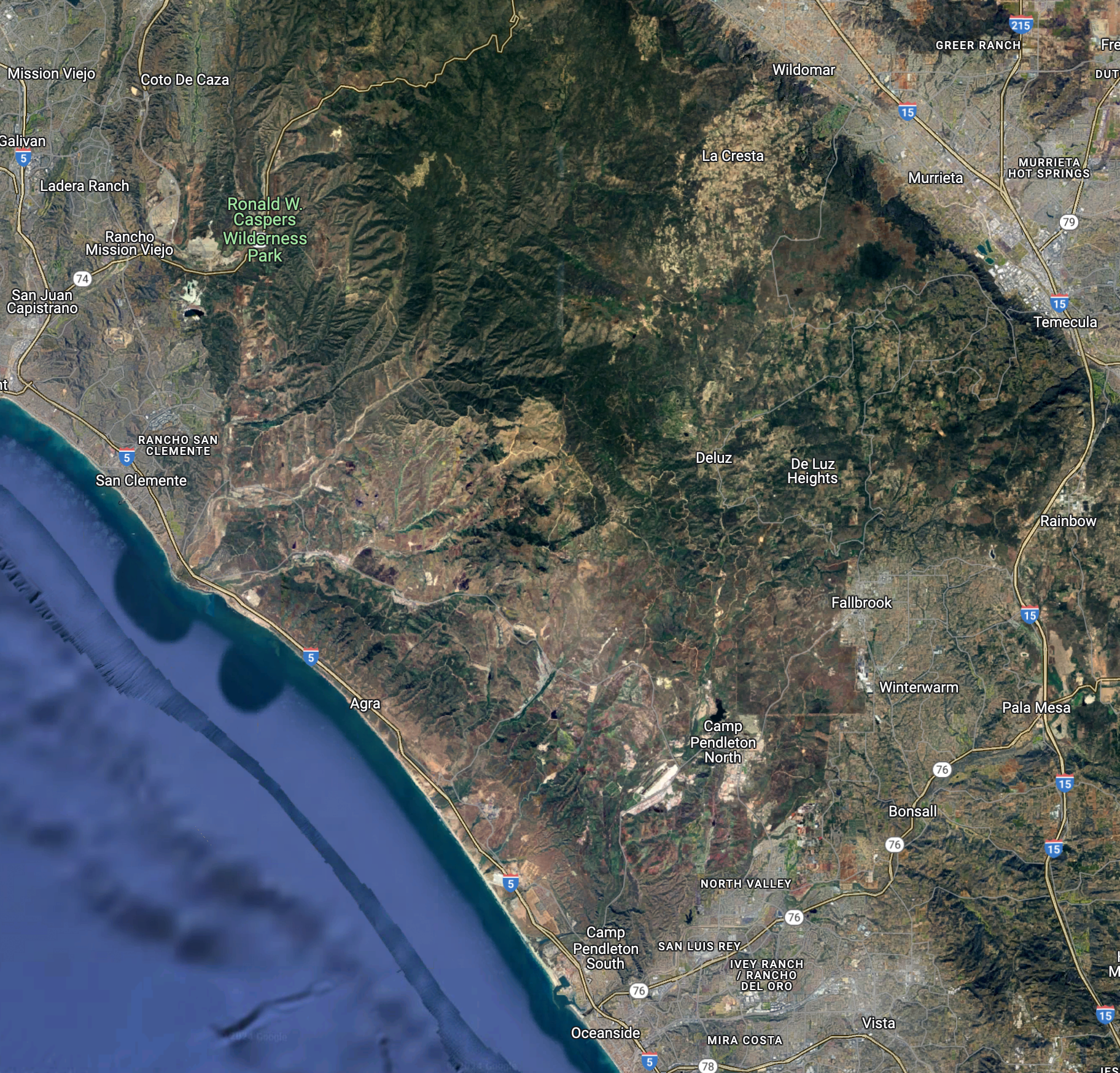
You can then look for the same section of the California coast with a regular map: 


If you look at the FlightAware progress chart, you can see the climb out of San Diego, reaching the cruising altitude, and estimate the average speed for the first 12 minutes of the flight (remember that I saw the blank spot around 12 minutes into the flight).  


It's difficult to get an exact speed, but let's estimate it at 250 mph (that includes the takeoff, etc.).  Flying for 12 minutes at 250 mph takes one about 50 miles up the coast along the flight path.  If you use the distance measuring tool again, you'll get this figure: 


So, I was somewhere off the coast between San Clemente and Oceanside.  Just looking at the map like this suggests that there's a big gap, an empty space, just east of the 5 freeway, between those two cities.  

Zooming in and taking a satellite image view, we see: 


That looks suspiciously empty.  But I'd REALLY like to see what this region looks like at night.  How can we do that? 

I did a search for:   

     [ night time view of US ]

 And quickly discovered NASA's Earth Observatory which has a truly great collection of images, including some of the US taken at night.    (High res image of the US at night.)   

You can zoom in on that image to find this overview of Southern California at night. 


Spend a couple of minutes aligning the image with the map from above: 

You can see the dark region just to the right of the flightline.  Zooming in on the map, you'll see that this area is home to Camp Pendelton, the San Mateo Wilderness, and Ronald W. Caspers  Wilderness Park.  A quick search to find map of parklands in CA:

     [ map of california parks ]  

leads to a nice interactive map by Databayou that lets you zoom into this region and find out all the details.  

Even though Southern California has a LOT of cities and built-up areas, there are still substantial parts of the state that are basically blanks.  For someone like me, looking for parts of the world that I don't know about or understand, this is just wonderful.  


SearchResearch Lessons

1. Remember there are multiple mapping systems out there.  We certainly know about Google and Bing maps--they're super easy to use and are relatively up-to-date. Remember that they have DIFFERENT images--sometimes one is better than the other, so check both.  Also remember that there are other places to get satellite images--remember NASA has great collections, mostly searchable.   

2. Use the tools that are in the maps systems.  Google and Bing maps both let you measure distances easily, they have ways to see the 3D nature of places, and can give you different views as well (e.g., topographic maps or Streetview).  

3. Combining data sources is often the key to solving Challenges.  As you see, we had to use maps + distance measures + FlightAware + NASA nighttime images to figure out what I was seeing out the window.  Combining data is often the way to go! 


Extra Commentary:  Thanks to all of our regular SRSers who continually amaze me.  Special thanks to Remmij who reminded me that there is a carillon at the Geisel Library.  It's a common sound in the central campus that's absolutely charming. (Well worth the read.)  Thanks also to Krossbow, who wrote his response in Seussian Rhyme!  With AI support, admittedly. Still very clever. 

In doing this, I also learned that Pereria was the architect for MY undergraduate library at UC Irvine, which is also, oddly enough, where Alexis Smith went to school, although we did not overlap.  


Keep searching!